KSP Data Export
2021
A mod for Kerbal Space Program to export flight data to a CSV file.
C#
GitHub Repo
Release
Forum Post
Have you ever wanted to see your flight data in beautiful charts?
Ever wanted to see a detailed log of your altitude, apoapsis, velocity, and much, much more?
Well, KSP Data Export allows you to do that!
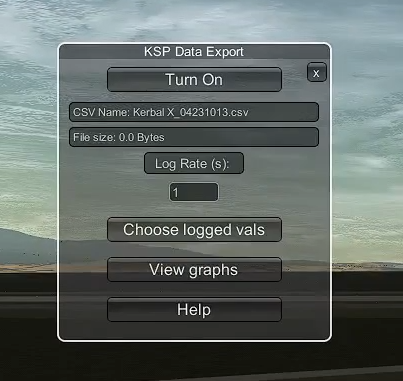
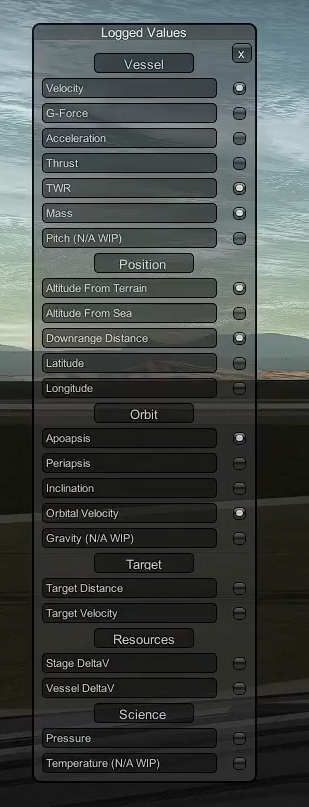
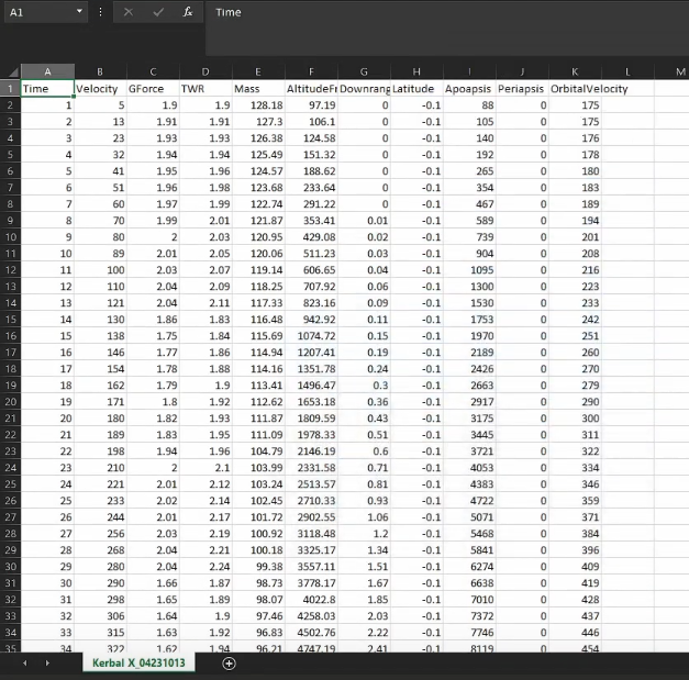
This mod allows you to choose from 20 different values to log (even more are coming in future updates), and neatly puts them into a CSV file. You can then use this CSV file in programs such as Excel or Google Sheets to create beautiful looking charts and graphs. Data is logged by default every one second, but you are allowed to change to whatever you would like.
I made this video to demonstrate some of the features:
Current Values to choose from
Vessel
- Surface Velocity
- G-Force
- Acceleration
- Thrust
- TWR
- Mass
Position
- Altitude (Terrain)
- Altitude (Sea Level)
- Downrange Distance
- Latitude
- Longitude
Orbit
- Apoapsis
- Periapsis
- Inclination
- Orbital Velocity
Target
- Target Distance
- Target Velocity
Resources
- Stage DeltaV
- Vessel DeltaV
Science
- Air Pressure
More values are coming soon!
Screenshots
Download
This mod is available on CKAN, as well as SpaceDock and CurseForge. If you prefer to download it on GitHub, the link is above.
So, I have the CSV. How do I make a graph?
You need to use a program such as Google Sheets or Excel to create the graph from the CSV file. For this example, I am going to use Google Sheets as it is free and beginner-friendly.
When you are in-flight, make sure to choose the values that you want to log and use in the graph. After your flight, click on the "View Graphs" button to show the CSV file in the file explorer.
Go to sheets.google.com.
Make a new spreadsheet.
Go to File > Import > Upload > and now choose the CSV file that was created by the mod.
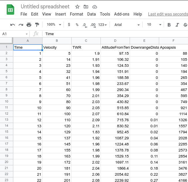
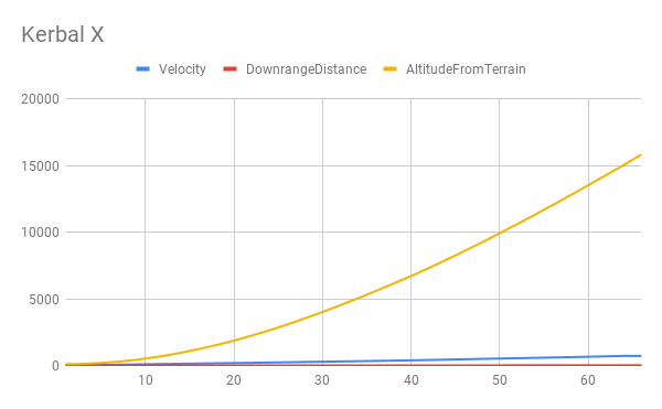
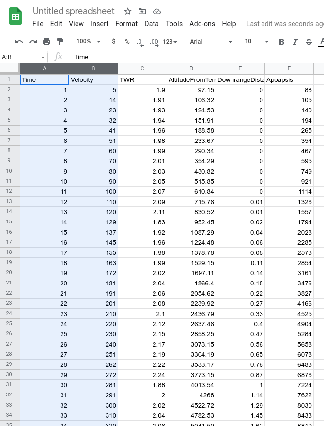
To make the chart, select the columns you want to use in the chart. For example, I want to make a chart with Time on the x-axis, and Velocity on the y-axis.
While you have them selected, go to Insert > Chart.
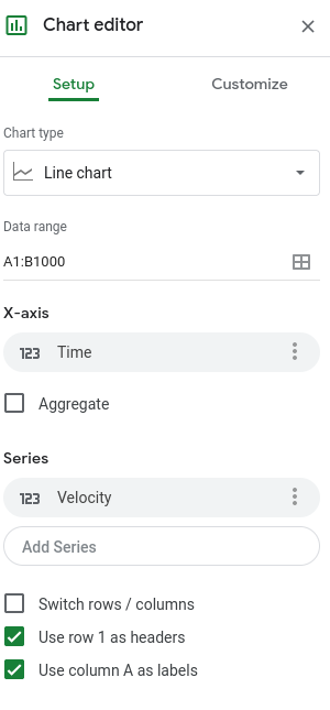
It will automatically generate a chart, but it may look off. We can fix this by double-clicking on the chart to open the Chart Editor. This is what it should look like:
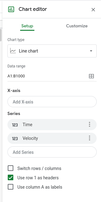
To fix this, we need to change the X-axis to time, by clicking on Add X-axis and choosing "Time". We need to remove the "Time" label from the Y-axis, so remove it from the "Series" section. It should now look something like this:
(Note, if you want to have multiple data sets on the y-axis, make sure to just add them to the "Series" section)
You can customize it a lot more by going to the Customize tab and changing the color, size, font, thickness, and much more. You can also have multiple lines on the chart by adding them through the Chart Editor. If you have a program like Excel, you can also make charts through there instead of using Google Sheets.